





- My role
- Brand identity, packaging and art direction
- Status
- Commissioned
- Context
- Through The 400 Studio

What needed to change
Beauty shelves are loud. COMMON wanted everyday skincare and makeup that felt personal and tactile, without joining the noise.
The idea I built from
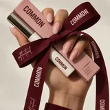
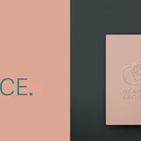
I called it a soft ritual. Burgundy, blush and kraft. A condensed wordmark. Pattern you can feel on the box. One handwritten line for warmth.
Where the system starts to work


What I did
- Identity system
- Logo
- Typography
- Colour and pattern
- Packaging
- Stationery
- Art direction for campaign imagery
The result
One identity that stays quiet and consistent from the lipstick to the ribbon on the bag.